 I have been playing with stamping color over the alcohol ink backgrounds, instead of just a solid black. I was inkspired by my ink pads. I looked over and creamy caramel and blush blossom just happened to be right beside each other on my ink rack, and I thought that they might look pretty nice together -- so I tried it. I actually really like the combination. This card was Only orange refill and terra cotta adirondack alcohol ink using the blending solution. Then I stamped the leaves from SU "Autumn Leaf Prints" in creamy caramel. I layered that on creamy caramel, and layered the whole thing on blush blossom cardstock. The "Just a Note" stamp is by Wordworth. I fell in love with it the last time I was at my local stamp store. I love how this turned out. Soft, but also very autumn.
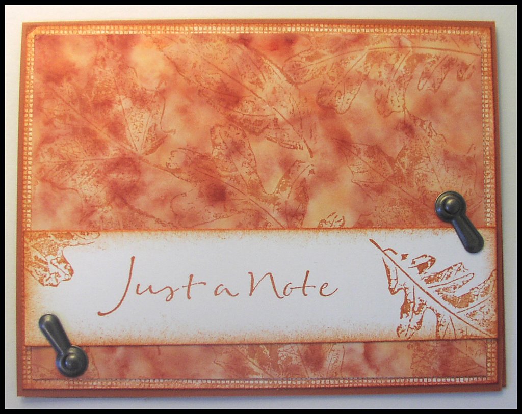
The second card was made using the same colors of alcohol inks, but less blending solution -- which made it much deeper and richer. I stamped the leaves from SU "Autumn Leaf Prints" in really rust ink. I layered this on a background, stamped with canvas background stamp, and sponged on the edged. These were both layered on really rust cardstock. I wanted to distress more on this card, but I cannot for the life of me find my Heidi Swapp paper edge distresser -- so I might just have to pick one of those up again *sigh*
So, are you sick of alcohol inks yet? I am so addicted, but I will try something new and different and exciting for you tomorrow . . .
Comments
debbie