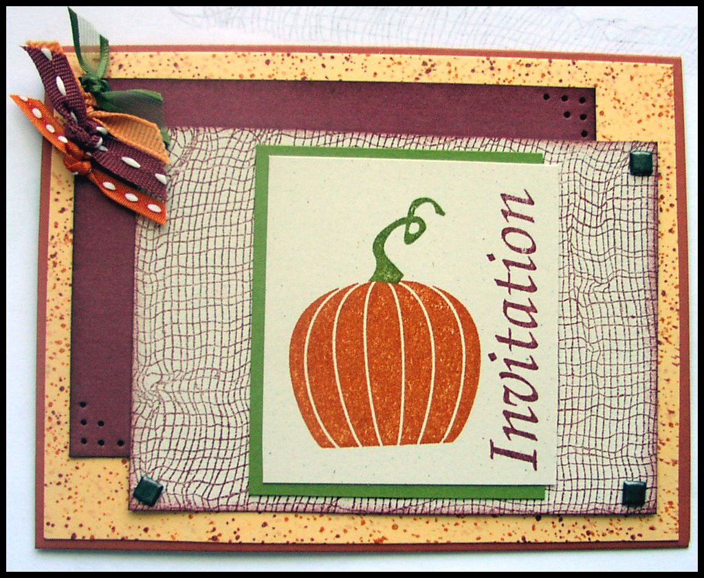
 It has been awhile since I have done a sketch challenge. This one appealed to me. I saw a card, last night as I was browsing, that I just loved the background paper on and loved the colors. It just inkspired me. It was by mlseward. The colors I used were cranberry crisp, pumpkin pie, apricot appeal, and old olive. The neutral paper is confetti cream (which you cannot really see in the picture, but is really obvious in the actual card). With the sketch challenge, I tried to recreate the background paper on mlseward's card using itty bitty backgrounds (SU). I really like how this turned out. I was also lucky to have lots of ribbon on hand that happened to match this color scheme. I made it an invitation because I swore to myself that today I was going to work on projects for my Halloween stamp camp, and invitations almost count since I might make invites for it. *smiles* Good justification eh? I used the cheesecloth because it is new for me. The brads (thanks Jody) were perfect for this layout and the piercing was an afterthought because I always have piercing somewhere on my cards. All in all, I am very satisfied with the results and I fully intend to play more with these colors a little later, after a shower, and after I go with the kids to get donuts which they are requesting this morning. . . . *sigh*It has been awhile since I have done a sketch challenge. This one appealed to me. I saw a card, last night as I was browsing, that I just loved the background paper on and loved the colors. It just inkspired me. It was by mlseward. The colors I used were cranberry crisp, pumpkin pie, apricot appeal, and old olive. The neutral paper is confetti cream (which you cannot really see in the picture, but is really obvious in the actual card). With the sketch challenge, I tried to recreate the background paper on mlseward's card using itty bitty backgrounds (SU). I really like how this turned out. I was also lucky to have lots of ribbon on hand that happened to match this color scheme. I made it an invitation because I swore to myself that today I was going to work on projects for my Halloween stamp camp, and invitations almost count since I might make invites for it. *smiles* Good justification eh? I used the cheesecloth because it is new for me. The brads (thanks Jody) were perfect for this layout and the piercing was an afterthought because I always have piercing somewhere on my cards. All in all, I am very satisfied with the results and I fully intend to play more with these colors a little later, after a shower, and after I go with the kids to get donuts which they are requesting this morning. . . . *sigh*
Comments