
COLOR CHALLENGE 78

I did color challenge 78. I think it turned out ugly, but as I have recently read, even some of the most awesome artists *ahem JulieHRR* turn out crud they don't like and have to redo things, so I decided to post my card anyway, and maybe you all will have some constructive criticism, or maybe you will like it and tell me I am insane. Either way, I decided that posting it would be wise.

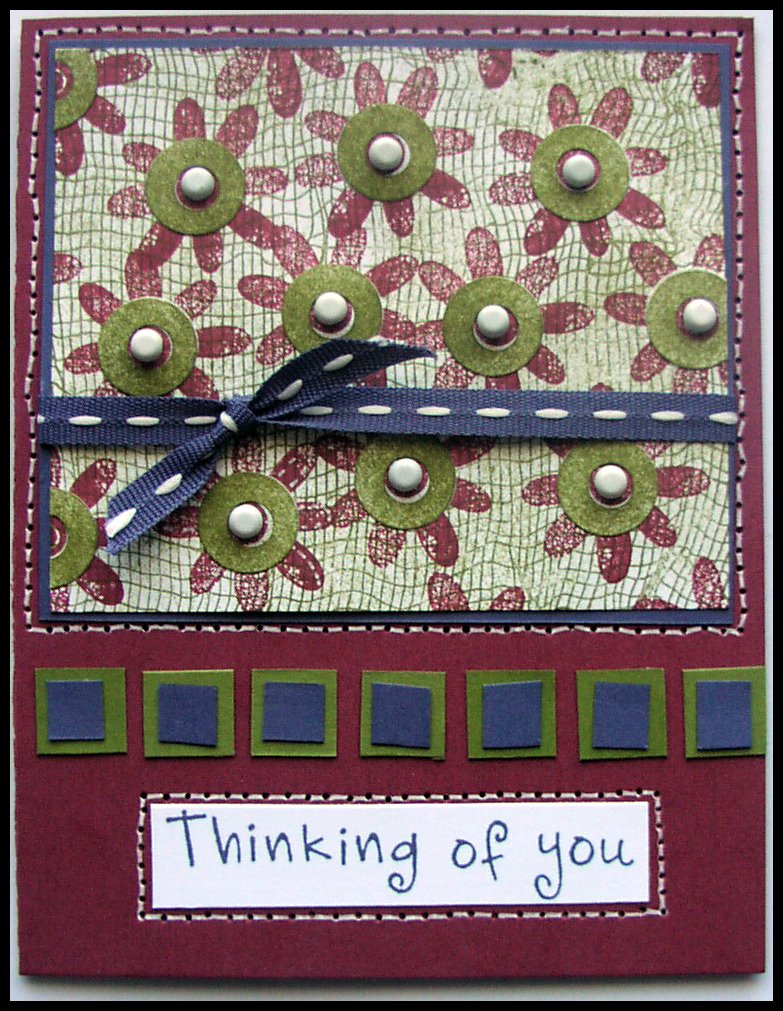
The colors were cranberry crisp, old olive and vintage violet. First I stamped the flower from SU "All Through the Year" in cranberry crisp on whisper white. I decided it needed something more, so I stamped the SU "Cheesecloth" background over it. Then I decided it was still too boring, so I sponged old olive ink on reinforcement circles and then added them as a center to each of the flowers. By the time I got that done, I decided that it was too colored looking and needed some white to POP! So, I pierced holes in the center of each one and added a white brad. Then I added the vintage violet ribbon because 1) I had it and 2) I thought it might bring out the violet edging. The stitching around the edge was pretty basic, piercing and white gelly roll. Then I stamped the sentiment (Katie & Co. from Michael's) in vintage violet on the cranberry and decided I had too much room above it and that it looked all alone, so I added the faux stitching around it and then the squares of old olive and vintage violet for interest in between. I think basically it just got to be too much, too busy, too creative . . .so I think it is ugly.

Comments

Popular posts from this blog

I don't have one but . . .

I came across this article today and thought it might be of interest to some of you, so I thought I would post it here: Provo Craft ended up on loyal customers' 'naughty' list Tell me what you think about this? Do you think Provo Craft was in the wrong? Do you think they should have done this? I wanna hear all the goods and bads.

Chase Away the Friday the 13th Blues . . .

and hop along in the Hanna Stamps "Good Luck Blog Hop!" Who believes in paraskavedekatriaphobia (fear of Friday the 13th)??? NOT ME!!! Friday the 13th is FAR from scary around here!!! I am so excited about this! I mean, how fun is it to blurf and then have an chance to win SURPRISE GOODIE BAGS for doing so??? It's so easy -- all you have do to be entered is leave a comment on this post, and then blurf on over to Cindy's blog and rinse and repeat. You can enter once on each of the design team members blogs and there will be a winner chosen at random from the comments left on each blog on Monday . . . HOW COOL EH?! If you are reaching this post out of sequence, the blog hop starts HERE at Kristi's blog . (Don't want you to miss all the possible opportunities to win.) This card is for the Friday challenge (HSFC60) in the Hanna Stamps forum over on splitcoast. This week Jeanne challenged us to use diamonds in our design, cause 'Hanna sparkles like a

HANNA PREVIEW: For the Soul

This set is totally cool! I have not seen anything like it! I think it is perfect for a sympathy card, a thinking of you, a little hand out at church, maybe even for cards at Easter (thinking ahead here) etc. It is so CUTE! Hanna looks so angelic and well, to be completely honest, reminds me of my little sister (not sure why). I used the sketch at Card Positioning Systems (#83) for the layout. I was going for a "touched by an angel" look on the main image (and I think I kind of created that.) I used vellum to overlay the image to give it that glossy fuzz (soft focus). Stamps : For the Soul (Hanna Stamps), "God Bless" sentiment by American Art Stamp Paper: Lily Kate - Basic Grey, Neenah Solar White, SU vellum card stock, SU Whisper White Ink : Onyx Black Versafine Accessories : Sheer 5/8th Inch organdy ribbon, Nestabilities (Circle and scalloped circle), sewing machine, white thread, circle of plastic canvas, copic markers, white brads, paper piercing